
The Ask
The CMO, at the request of the company president, asked me to evaluate whether FACTS' visual identity, particularly our color usage, was aligned with current business goals and appropriate for the markets we serve and plan to enter. There was specific concern that our secondary color palette made the brand feel too youthful.
My Approach
Audit: Conducted a comprehensive audit of brand usage across all customer and sales touchpoints including website, sales collateral, videos, social media, and digital documentation.
Brand Guidelines Review: Identified the absence of a stacked version of our logo.
Competitive Research: Analyzed ~30 competitors in the SaaS education market and adjacent industries, focusing on color trends, layout, and visual hierarchy.
Website Comparisons: Created side-by-side screen comparisons to assess whitespace, header usage, and color application.
Insights
Blue was the most commonly used brand color in our space—23 companies used blue as a significant color, followed by green (9), red/pink (5), and purple (2). While each brand was different, each incorporated bright colors in a deliberate, strategic way.
Based on these findings, I concluded that our color usage was both consistent with industry norms and well-positioned for future market expansion. Our branding, particularly in the educational SaaS sector, did not skew too young when viewed in context. Our large palette and considered use of color was a strong component of our visual identity.
Additionally, I arrived at several recommendations to consider regarding website design: use the space "above the fold" more effectively, use more white space in content areas, create graphics that tell a story, and incorporate motion throughout the page.
Solution
I designed the missing stacked logo (for consideration) and assembled my research and proposals into a deck which I presented to the marketing director and CMO. I cautioned against making major changes to our current visual identity, but offered the following proposals to evolve the brand system:
• Revise the wordmark from brand blue to brand gray to “mature” the visual identity.
• Introduce several tertiary colors to increase flexibility in the brand palette.
• Develop a color-coded system for product iconography across categories.
• Adopt a stacked version of the company logo to increase usability across formats.
While the wordmark color change to gray was ultimately not adopted, all other proposals were approved and implemented.
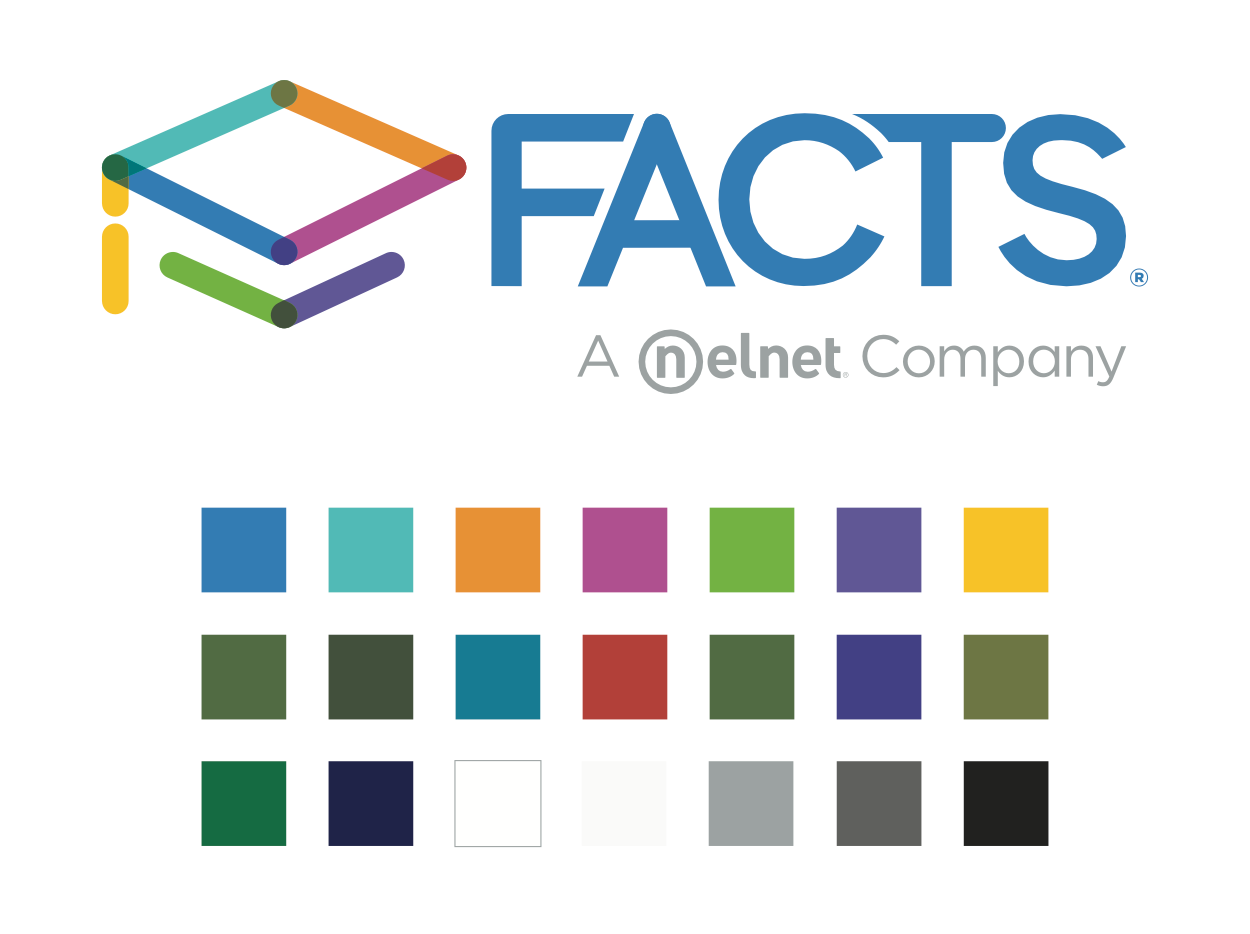
FACTS Extended Color Range
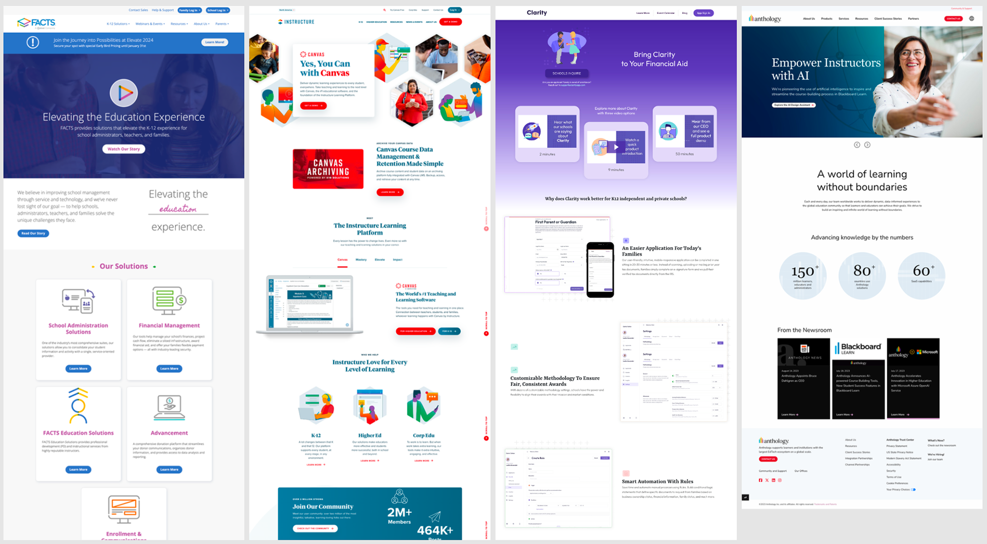
Competitor Website Evaluation

Stacked Logo
Outcome
The downstream effects of my direction went into effect almost immediately, when we began redesigning the company website and collateral. We were able to use my findings to inform many layout and design choices across all newly created assets. Although some referred to it as a rebrand, it was in effect a rolling refresh of all marketing materials, one that enhanced our visual consistency and expanded the versatility of our brand system.
Ultimately, my research served as a foundational guide for a cohesive visual refresh, reinforcing brand consistency across all marketing materials. The work strengthened our brand’s credibility while preserving its equity, providing a solid foundation for continued growth across new and existing markets. The refreshed brand direction improved internal alignment and helped clarify our positioning with partners and clients.